A luxury jewellery brand identity crafted to embody elegance, heritage, and timeless beauty — born from the soul of Nyatana’s artistry.
Client
Adorn by Nyatana
Year
2025
Service
Logo Design
Industry
Jewellery / Luxury
The Brief
The Challenge
Nyatana — a passionate jewellery artisan — needed a brand identity that could stand shoulder-to-shoulder with established luxury houses. The challenge was to create a logo that whispered sophistication rather than shouted it: minimal, memorable, and unmistakably premium.
The brand needed to resonate with a discerning clientele who values craftsmanship and authenticity, while remaining versatile across packaging, digital channels, and fine print materials.
Project Goals
Convey luxury, elegance, and heritage
Incorporate a jewellery motif organically into the wordmark
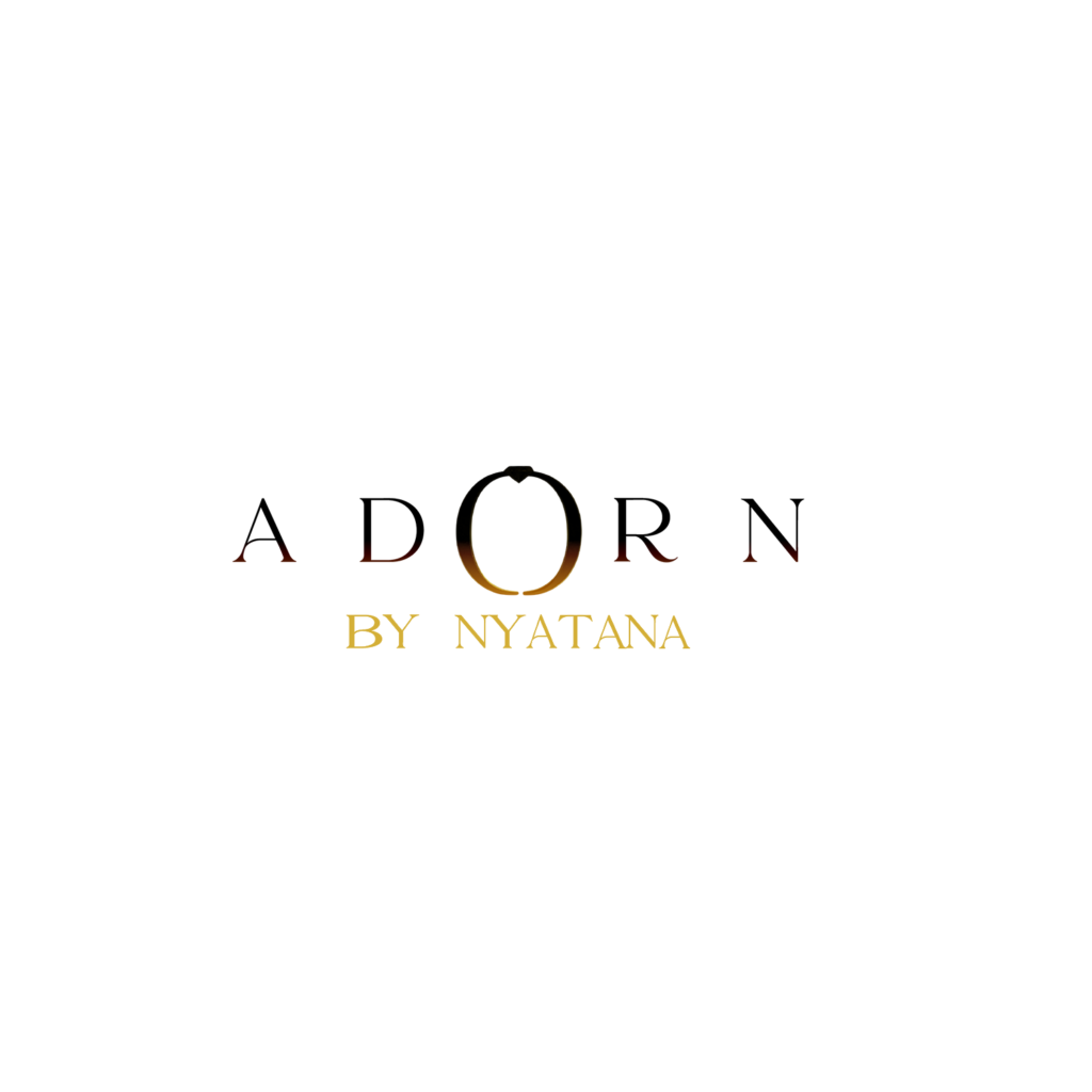
Work seamlessly on dark and light backgrounds
Timeless — not trend-driven
Versatile across print and digital media
Creative Process
The Design Approach
01
Research & Concept
Deep dive into luxury jewellery brands globally — studying visual language, spacing, typographic traditions, and how gemstone motifs are used tastefully in wordmarks.
02
The Ring Detail
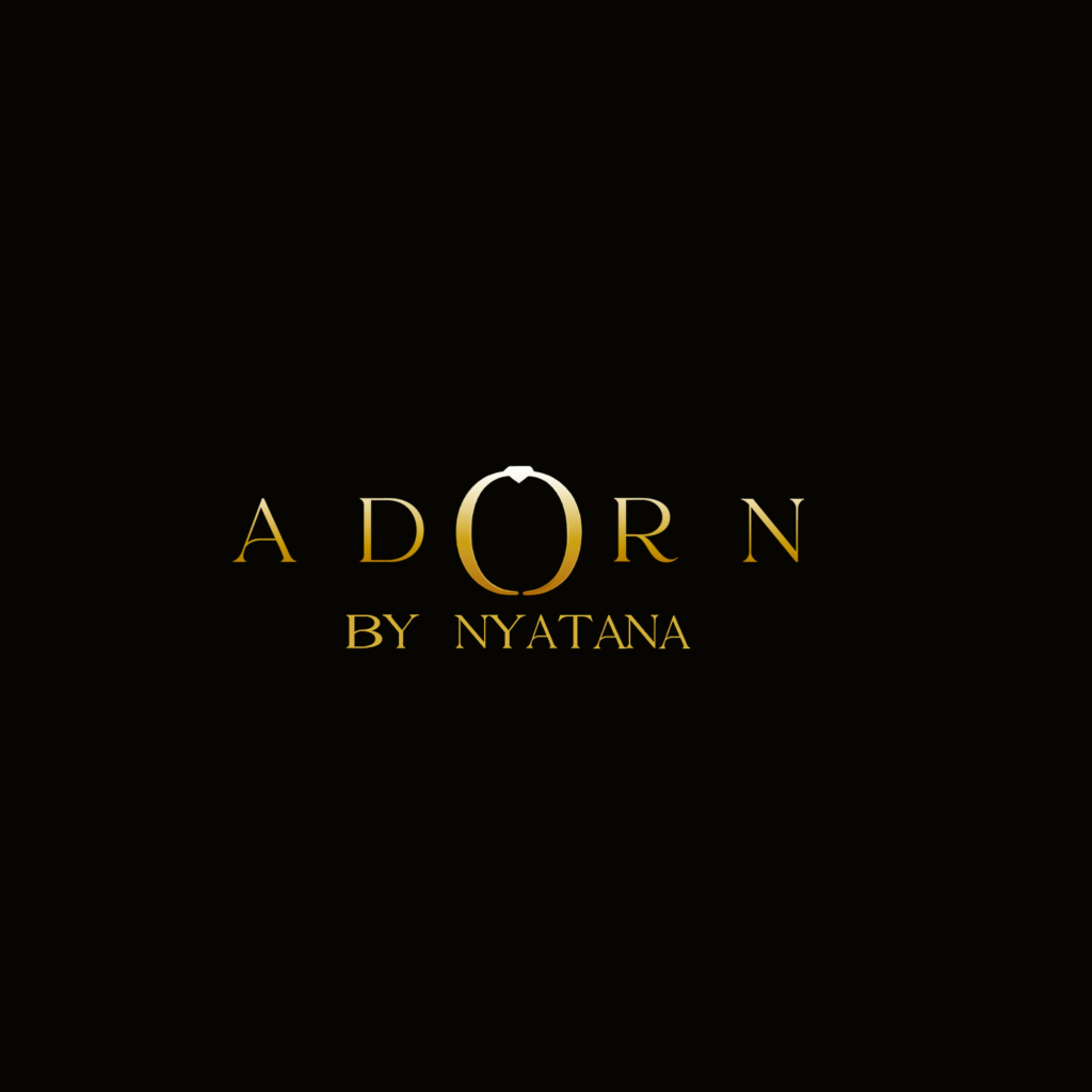
The ‘O’ in ADORN was transformed into an elegant ring silhouette — immediately referencing jewellery without being literal. The gem setting at the top of the ring adds a subtle deluxe detail.
03
Typography & Refinement
Wide letter-spacing and a classic serif-inspired display font give the wordmark an editorial, high-fashion feel. Gold gradient reinforces the luxury positioning.
Logo Showcase
Final Deliverables
Brand Colors
Gold Gradient
#DAA520 → #FFD700
Obsidian Black
#0A0A0A
Pure White
#FFFFFF
Typography
Wordmark
ADORN
Wide-tracked serif display — commanding, classic
Tagline
BY NYATANA
Lighter weight, refined spacing — adds provenance
Ring Detail
The ‘O’ letter is artfully replaced with a ring icon — embedding the brand’s core product into the wordmark without sacrificing readability.
Outcome
A Mark that Endures
The final logo struck the perfect balance between accessibility and aspiration. Nyatana received a brand identity that positions her jewellery label confidently in the luxury market — versatile enough for Instagram, elegant enough for jewellery tags, and distinctive enough to be remembered.
The ring-as-letterform concept became the brand’s signature detail — immediately recognisable and deeply meaningful, linking the visual identity directly to the craft it represents.
A modern real estate web presence built to convert — showcasing prime plots of land across Kenya’s fastest-growing regions with trust-building content and a seamless user journey.
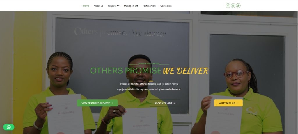
Chosen Soil Limited — a Kenyan real estate company specialising in title-ready plots in fast-growing regions — needed a digital presence that could command trust, clearly showcase their land offerings, and convert visiting buyers into leads without friction.
Their target audience ranges from first-time land buyers in Nairobi to diaspora investors seeking affordable, secure land with strong growth potential. The website needed to speak credibly to both.
A key challenge was communicating technical concepts — title readiness, infrastructure quality, county locations — in a visually engaging and easy-to-understand format.
Prominent stats bar — 6 Premium Plots, 100% Title Ready, 5+ Years of Trust — immediately answers the buyer’s most critical questions above the fold.
02
Property discovery
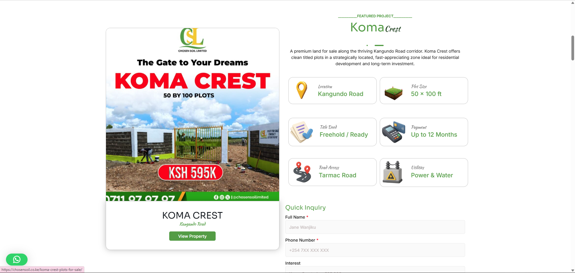
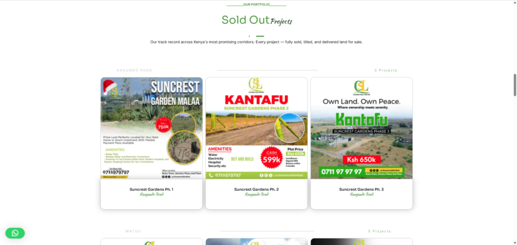
Filterable property cards with aerial photography, pricing, location tags, and county labels allow buyers to browse plots intuitively across Machakos, Murang’a, and beyond.
03
Mobile – First UX
Majority of Kenyan land buyers browse on mobile. The entire site is designed mobile-first with thumb-friendly CTAs and fast-loading property images.
04
WordPress + Elementor
Built on WordPress with Elementor Pro for easy content management — Chosen Soil’s team can update listings, add new projects, and post blogs without developer help.
05
Individual projects pages
Each plot development (e.g. Suncrest Gardens Phase 2, Kantafu) gets its own dedicated landing page with aerial imagery, specs, and a direct inquiry form.
06
Lead Generation forms
Strategic CTA placement throughout the site funnels interested buyers into WhatsApp conversations and email inquiries — the primary sales channels for Chosen Soil.
Brand Colors
Forest Green (Primary)
#2A7A2A
Obsidian Black
#0A0A0A
Full Gold
#f3c635
Tech Stack
WordPress CMS
Content management & flexibility
Elementor Pro
Visual page builder & design system
WPForms
Lead capture & inquiry forms
Yoast SEO
Search engine optimisation
WhatsApp Integration
Direct buyer-to-sales communication
What's Still in Progress
The Chosen Soil website is live and actively generating leads, but work continues. New property developments are added regularly, and ongoing UX improvements are being implemented based on real buyer behaviour data.
This project reflects a long-term client relationship — not just a one-off delivery — and demonstrates the full-cycle value of design, development, and strategic content guidance.
The ring-as-letterform concept became the brand’s signature detail — immediately recognisable and deeply meaningful, linking the visual identity directly to the craft it represents.